For this edition of WHAT/IF, I took on the challenge of redesigning the logos of the eight national teams that reached the EURO 2020 quarterfinals. This was a spontaneous, experimental project that took about six hours, from initial sketches to final execution.
Approach
My goal was to explore how these national football identities could be interpreted in a corporate branding style while keeping their essence intact. The strategy behind each redesign involved:
Merging elements from the national flags and existing logos to create a sense of familiarity.
Incorporating the first letter of each country’s name to enhance recognizability.
Keeping the style modern, bold, and versatile, as if these were corporate brands rather than traditional football emblems.
BONUS: Argentina – Copa América 2021 Champions
Alongside the EURO 2020 series, I also experimented with a corporate-style redesign of Argentina's Football Association logo, celebrating their Copa América 2021 victory.
This project was a fun design exercise, blending sports identity and corporate aesthetics. It was an exciting way to push logo design boundaries while maintaining the core symbolism of each nation.
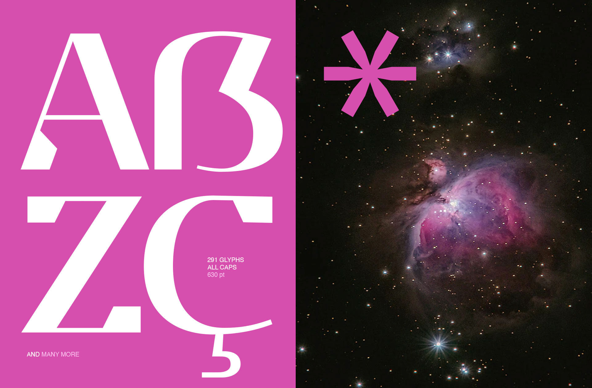
Typography shapes the way we perceive design, and finding the perfect balance between modern innovation and timeless appeal is no easy feat. That’s why I’m excited to share EP Stellari, my first-ever font creation, designed to bring a bold futuristic feel with a subtle classic touch.
EP Stellari is a modern, futuristic display font crafted with a unique blend of bold and thin lines. It draws inspiration from traditional serif elements while embracing the strong, sleek forms of futuristic design. Whether you're working on branding, posters, UI design, or any creative project, this typeface adds a striking and sophisticated character to your work.
Pay Whatever You Want
I’m offering this font as a pay-what-you-want download. You can get it for free by entering "0" in the price section, or support my work with a contribution of $1, $2, $10—whatever feels right to you!
FREE for personal & commercial use Redistribution is not allowed
BMW has just unveiled its brand-new logo, joining the growing list of automakers embracing flat design. Before BMW, both Volkswagen and Kia had already made similar moves, paving the way for this trend in the automotive industry. At this point, it feels inevitable—flat design is taking over. But why are so many car brands shifting in this direction?
BMW’s New Logo, A Closer Look
In case you haven’t seen it yet, here’s the new BMW logo:
According to Creative Bloq, this marks BMW’s "most radical logo change in over 100 years." So, what exactly has changed? Let’s break it down:
Transparent Background – The iconic black outer ring is now gone, leaving a transparent gap.
Refined Typography – The letters "BMW" maintain a bold and retro-inspired look, blending classic and modern aesthetics.
Flat Design Over Skeuomorphism – The three-dimensional effect of the previous logo has been removed in favor of a minimalist, flat design.
A Trend in the Automotive Industry
BMW’s new emblem first appeared on the BMW i4 Concept, a next-generation electric vehicle. This move mirrors similar branding updates by Volkswagen and Kia, both of which embraced flat, modern aesthetics when unveiling their latest electric models.
Why now? Well, the future of mobility is electric, and legacy automakers are racing to reinvent themselves in an industry increasingly dominated by Tesla. A modern, digital-friendly identity helps these brands signal their forward-thinking approach to new technology, sustainability, and innovation.
Volkswagen introduced its simplified flat logo in 2019, revealing it alongside its new ID.3 electric vehicle. The change reflected VW’s commitment to electric mobility while making the logo more adaptable to digital interfaces. Kia followed in 2021 with a fresh new wordmark, shedding its oval badge in favor of a futuristic, continuous script. Now, BMW is making a similar statement, reinforcing its position in the evolving automotive landscape.
The Future of Automotive Branding
These logo redesigns aren’t just about aesthetics—they’re strategic moves aimed at shaping brand perception in a rapidly changing market. As electric vehicles become the new standard, car manufacturers must present themselves as innovative and cutting-edge. Design plays a crucial role in this transformation.
Tesla, the industry’s trendsetter, has established a high benchmark for modern automotive branding. Its sleek, minimalist approach has influenced not only car design but also how automakers present themselves visually. For brands like BMW, Volkswagen, and Kia, embracing flat design isn’t just about following a trend—it’s about staying competitive in an industry undergoing a fundamental shift.
So, will we see more automakers following suit? Most likely. As the competition in the EV space intensifies, expect more legacy brands to refresh their identities, aligning their visual language with the digital and electric age.
Here are some of the infographics I personally designed at Good News From Indonesia (GNFI), excluding projects where I served as creative director or supervisor.
A designer’s worst client is themselves. I totally agree!
When creating my own identity, I went through countless doodles and logo ideas, always chasing perfection—but never quite reaching it. I treated myself like an important client, going through planning, designing, revising, and repeating the process over and over. If you’re a designer, you’ve probably done the same thing!
The Struggle of Finding the Right Logo
I experimented with many different concepts. Looking back, I realize how tough I was on myself as both the client and the designer. But I wasn’t just being a perfectionist—I only had three simple goals for my logo: simplicity, beauty, and meaning. Sounds easy, right? But it wasn’t.
Previous /// Some logos & concepts I have made
At some point, I had to ask myself: What’s the real goal? When it comes to an end? I realized I was focusing too much on making a cool, memorable logo instead of creating something that truly represented me—my spirit, my ambitions, and my story.
My goal was not just about making a sparkling and memorable logo. But how this logo could represent my spirit, will, dreams and bla bla bla.
The soul.
Finding the Soul of the Logo
I went back to my original ideas and decided to keep the letter ‘E’ as the main concept. Then I thought about logos that inspire me, like Twitter’s bird, the Garuda Indonesia emblem, and Liverpool’s Liverbird (yes, I’m a Kopite!). These logos aren’t just symbols; they represent movement, confidence, and a strong spirit.
Birds and wings inspired logo /// Twitter, Liverbird (Liverpool) and Garuda Indonesia
Bringing the Idea to Life
I explored ways to shape the letter ‘E’ into something more dynamic and meaningful. I wanted it to reflect my identity in a simple yet powerful way.
Concept /// Representation of main idea for the new logoConcept /// Composing CurvesLinear /// Color System
The process involved refining curves, choosing the right colors, and testing how the logo worked in different formats—like letterheads, portfolio covers, posters, and even t-shirts.
Cover /// Book of PortfolioGetting attention /// On poster and tee
Voila! The Final Result
After all the experiments and revisions, I finally created a logo that feels right. You might not love it as much as I do, but that’s okay! What matters is that it represents me and tells my story.
I worked on layout and infographic design for Juanda Magazine, collaborating directly with Angkasa Pura Airports, the operator of Juanda Airport. This project was part of my work with Good News From Indonesia, with Angkasa Pura Airports as the client.