So, did you see those "rainbow clouds" over Jonggol, Bogor (Indonesia) recently? Click here to read the news. Honestly, it looked like something straight out of a movie, but we shouldn't be worried and it’s definitely not a glitch in the matrix.
Here’s the tea on what was actually going on:
It’s basically nature’s disco ball
According to the weather folks a.k.a Meteorology, Climatology, and Geophysical Agency (BMKG), it’s actually pretty simple. Imagine the sun hitting tiny water droplets hanging out in the air—maybe from some rain nearby. Those droplets acted like little prisms, catching the light and breaking it into those crazy colors.
The reason it didn't look like a normal rainbow "arch" is because there was this big, chunky towering cumulus cloud growing right there. It basically cut the rainbow off, hiding the rest of it and making it look like the cloud itself was just glowing with colors.
It was so unbelievably magical that when my friend shared it on Instagram, the app actually flagged it as AI-generated!
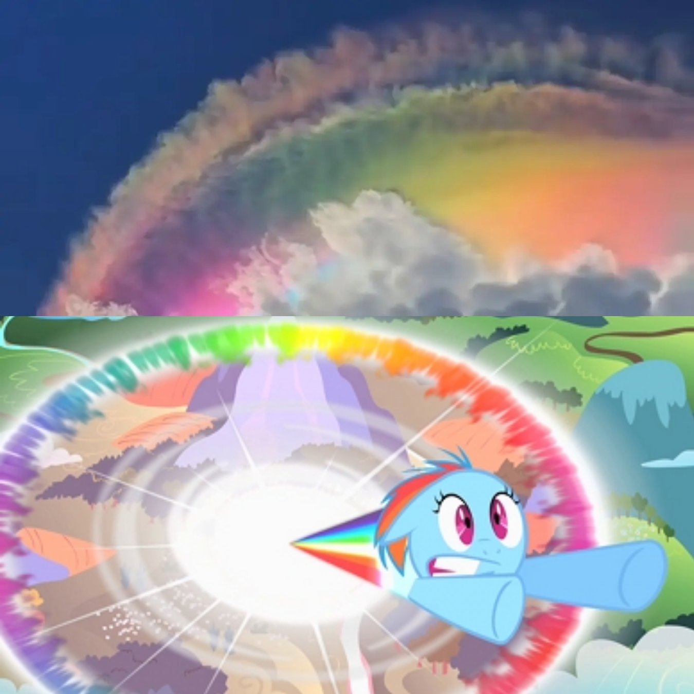
Major Rainbow Dash vibes
Just last night, while watching My Little Pony with my daughter, we both started laughing at how much a recent fireball looked like Rainbow Dash’s Sonic Rainboom, If you’ve ever watched. It was the exact same burst of light and color.
You know that moment where she pulls off a crazy stunt and the sky just "bursts" with color? That’s exactly the vibe it had. It wasn't a perfect, sleepy bow across the horizon; it was more like a localized explosion of color tucked behind the clouds.
Is it a bad sign?
Not at all! It’s actually a sign that the clouds are working overtime. While it might have been perfectly sunny where people were standing, those "rainbow clouds" were just nature’s way of saying, "Hey, I'm building some rain clouds over here, might get a bit wet later!"
TL;DR:
No flying ponies were harmed, and no magic was involved. Just the perfect combo of sunlight, water, and some clouds playing hide-and-seek.
Definitely a "stop and take a photo" kind of moment!
So, surely with hardship comes ease. Surely with ˹that˺ hardship comes ˹more˺ ease.
It’s not just a quote.
It’s God’s words, in the Qur'an Surah Ash-Sharh (94:5–6).
This is my go-to motivation to stay patient when facing difficulties. There’s a promise that ease comes with hardship—not after, not before, but with. It means at the same time.
Also, it’s not that one difficulty comes with just one ease—it’s more than that.
As translated by Dr. Mustafa Khattab, the ayah is repeated. The word “hardship” (ٱلْعُسْرِ) is a definite noun repeated twice, meaning it refers to the same hardship—one hardship. But the word “ease” (يُسْرًۭا) is an indefinite noun repeated twice, meaning it refers to different forms of ease.
So these two ayahs give us confidence that for every single definite difficulty, Allah provides multiple, indefinite forms of ease.
FC Como Women feels more like fashion than football. The jersey looks like a fashion piece. Not just sportswear. The brand is quiet. Minimal. Very controlled. Typography, photos, layout—everything moves in one tone. Soft, but confident. Editorial, but still football. What makes it stand out is not complexity. It’s restraint. Clear. Precise. And that’s what makes it beautiful.
What I find interesting from this post is how Italian football once had such a strong visual identity.
Not just famous clubs like AC Milan, Inter, or Juventus. Even smaller clubs had logos that felt bold, minimal, and unforgettable.
Simple shapes. Strong colors. Clear symbols. A wolf for Roma. An eagle for Lazio. A flower for Fiorentina. A sailor silhouette for Sampdoria. They looked more like timeless emblems than modern sports branding.
There was confidence in that simplicity.
Today, many football logos try too hard to look modern. Cleaner, flatter, safer. But often they lose character in the process. Old Italian football crests were different. They were not designed to follow trends. They were designed to represent cities, history, and pride.
That is why many of them still feel stronger today.
Camping has always been one of those experiences that stays with me.
Back then when I was kid, I used to camp quite often, not only in forests or mountains, but also in simple places. Even now living in Jakarta, I still try to create that feeling. One time, I set up a small camping moment in the front yard of my house with my two toddler girls to celebrate New Year’s Eve. It was just a simple tent, some snacks, and the excitement of sleeping outside.
For them, it felt like a big adventure, and for me, it was a warm reminder that camping is really about creating memories.
My last serious camping trip before marriage life was during college, back in 2008. We camped in the forest, and I really enjoyed the experience. Proper tents, proper trekking, and time away from the city made everything feel refreshing. The trekking experience in tropical forests is something special. The smell of wet soil, the sound of leaves, and the fresh air create a feeling that is difficult to replace, especially compared to the city of Jakarta.
About two years ago, I went camping again with my office mates as part of an office event in West Java. It was a good experience after such a long time. The trekking route was challenging enough to make it exciting, and everything around us felt fresh. The water was clear, the air was cold, and the environment felt peaceful. It reminded me how much nature can reset our minds after daily routines in the city.
But my best camping experience was during junior high school when I joined Jambore Cabang at Bumi Perkemahan Simbarwangi, Bendungan, Kabupaten Trenggalek. That trip made me realize that I probably cannot handle extreme cold very well. It was the coldest camping experience I have ever had. My skin became very dry, my lips cracked badly, and even my skin started peeling. It was uncomfortable, but that is exactly why I still remember it so clearly.
Sometimes, the hardest camping experience becomes the most unforgettable one.
I recently took the Adobe Creative Type test, and it labeled me as a Luminary—someone who dreams big and believes deeply in what’s possible.
It feels surprisingly accurate.
As a designer, art director, and visual storyteller, I’ve always been drawn to the kind of work that brings meaning, clarity, and beauty into the world. Whether it’s crafting a brand identity, visualizing data, or leading a creative team, I approach every project with the belief that design is not just about how things look—but about how they connect and inspire.
“In astronomy, a luminary is a light-giving body. You shine a light in the darkness, illuminating pathways to a more beautiful world you know is possible.”
That line stood out to me. It captures something I’ve felt but never really put into words.
The test describes Luminaries as intuitive creators who mine the depths of their inner world to unearth precious gems worth sharing. They’re idealists who don’t just see problems—but possibilities. That’s the kind of energy I try to bring into my work: optimistic, imaginative, and purpose-driven.
💡 My creative strengths: — Seeing possibilities beyond the ordinary — Turning big ideas into reality — Connecting meaningfully through design and storytelling
🧭 What drives me: — A strong sense of clarity, meaning, and balance — Building visuals that make complex ideas feel human — Believing that design can genuinely help make the world better—even just a little
Like many Luminaries, I’ve often felt like an idealist in a world that moves fast, demands certainty, and favors what's familiar. But I’ve learned to see that as strength. I’d rather believe in something deeply and build toward it, even if the path is slow or unclear.
“The world depends on the Luminary to dream the future into being.”
Most of my past work came through offers, not through applications. So I’ve never really had to actively search for a job before. You could say I was lucky—or just always focused on doing the work. But after finishing my time at Indonesiabaik.id, that changed. I entered a completely new phase: job hunting.
It started with filling out forms. Then came the waiting. And the silence. Sometimes, polite rejection emails would arrive. Most times, nothing at all. I quickly realized this wasn’t going to be as simple or smooth as I had expected.
At Indonesiabaik.id, I led a creative team under the Ministry of Communications and Informatics. We produced public information content based on data—infographics, videos, digital reports, and visual assets that aimed to make complex issues easier to understand. That experience helped shape me into a creative leader and deepened my skills in visual storytelling and design. Naturally, I thought this portfolio and background would translate easily into my next opportunity.
But it didn’t. The job market felt fast-moving, overwhelming, and sometimes unclear. I realized being a generalist—someone with a wide range of experience—can be a double-edged sword. I had strong experience across several areas, but it was still hard to find that one role that felt like the perfect fit.
What really helped shift my perspective was learning from the person closest to me—my wife. She’s been through this cycle many times and reminded me that showing up is part of the work. I watched her send out dozens—maybe hundreds—of applications over the years. Many led to silence. Some led to interviews. A few turned into incredible opportunities, including roles at top companies.
One thing she told me really stuck: “Habiskan jatah gagalmu.”Use up your quota to fail.
Now, I carry that with me. I see rejection as part of the process, not a reason to stop. I’ve learned to keep showing up—to put myself out there, to share my work, and to stay open to what might come next.
So here I am, actively open for new opportunities:
▪ Freelance projects in graphic design, data visualization, or creative direction ▪ Full-time roles that align with my skills, values, and creative focus ▪ You can view some of my work here: https://edypang.com
Logo is more than just a pretty design—it’s the face of the brand. It’s what people recognize, remember, and connect with. For your own business, with so many different types of logos, how do you know which one fits your brand best?
Let’s break it down, one by one.
Wordmarks (Logotypes)
If your brand name is unique and easy to remember, a wordmark might be the way to go.
Think Google, Coca-Cola, or Disney—logos that are all about the font.
Works best for businesses with short, distinct names.
Typography is everything. The right font can make or break a wordmark.
Most popular in fashion—Gucci, Chanel, and Louis Vuitton all use them.
If you go for a wordmark, don’t just pick a random font. You need something that feels custom, polished, and reflective of your brand.
Lettermarks (Monograms)
When your brand name is long, a lettermark helps keep things simple.
Uses initials instead of the full name—think HBO, CNN, or NASA.
A clean, professional look that works great for corporate and tech brands.
Short and easy to recognize, especially in digital spaces.
If your company has a long or complicated name, a lettermark can save you from an overcrowded logo.
Letterforms (Letter Logos)
Letterforms take minimalism to the next level.
Uses just one letter—like McDonald’s “M” or Netflix’s “N.”
Simple, bold, and instantly recognizable.
Works best when the letter design is unique and memorable.
The trick here is to create something iconic with just one letter. That’s why strong typography is non-negotiable.
Pictorial Marks (Logo Symbols)
A picture is worth a thousand words—especially when it’s your logo.
Uses a single, recognizable icon—like Apple’s apple or Twitter’s bird.
Best for brands that are already well-known.
Can symbolize your brand’s values or industry.
Pictorial marks are powerful, but they take time to build recognition. If you’re just starting, pairing it with a wordmark (at least at first) might be a smart move.
Abstract Marks
Abstract logos are all about creativity and uniqueness.
Uses geometric or artistic shapes instead of a literal image.
Think of Nike’s swoosh or Adidas’ three stripes—simple but iconic.
Doesn’t tie your brand to a specific object, giving more flexibility.
The key here? Keep it simple. A good abstract logo should be memorable, not confusing.
Mascot Logos
Mascots add personality to a brand like nothing else.
Features an illustrated character—like KFC’s Colonel Sanders or the Pringles guy.
Works great for family-friendly, playful, or food brands.
Grabs attention and makes your brand feel more relatable.
The downside? Mascots don’t always work for every platform, especially in small-scale branding like app icons or business cards.
Combination Marks
Can’t decide between a symbol and text? Go for both. This usually happens when you want to use a symbol as a logo, but there’s a concern that it might not be easily recognizable.
Pairs a wordmark or lettermark with a symbol—like Shopify, Lacoste, or HappyFresh.
Offers flexibility: You can use the full logo or just the symbol when needed.
Ideal for new businesses that want strong brand recognition.
Combination marks are one of the most common logo styles—and for good reason. They’re versatile, clear, and easy to use across different branding materials.
Emblem Logos
If you want a logo with a classic, official feel, an emblem might be your best bet.
Features text inside a symbol or badge—think Starbucks, Manchester City, Inter Miami, or Harley-Davidson.
Feels timeless and prestigious, often used by universities or government organizations.
Has a lot of detail, which can make it harder to scale down for small designs.
Emblems work great for brands that want a traditional and sophisticated look. Just make sure it’s not too complex for digital use.
So, Which Logo Type Is Best for You?
Now that you know the 8 types of logos, how do you choose the right one? Here’s what to consider:
Your Brand Name: If it’s unique and short, a wordmark works. If it’s long, consider a lettermark.
Your Industry: Abstract and pictorial marks are great for tech and lifestyle brands, while emblems work well for institutions.
Your Audience: Mascots are fun and friendly, while letterforms feel sleek and modern.
Your Growth Plans: If you plan to expand globally, an abstract or pictorial mark might be a smart move since it’s not tied to a specific language.
Your logo is one of the most important elements of your brand identity. Take your time, experiment, and find a style that truly represents what you stand for.
If I had to pick one way to travel cross-country, I’d go with the train. No doubt about it.
Planes are fast, sure. But only when they’re actually flying. Add up the trip to the airport, check-in, security, waiting at the gate, possible delays—it’s not always as quick as it seems. And airports? They’re usually far from the city, which just adds to the hassle.
Buses? Not my thing. They share the road with everyone else, which means traffic. Maybe a sleeper bus would be interesting to try someday, but overall, I don’t see it being my go-to.
Cars? Nice if you want control, but not great when you're on a tight schedule.
Motorcycles? I used to love them in my 20s. The freedom, the thrill—nothing like it. But let’s be real, they’re risky.
The train, on the other hand, is just right. It’s comfortable, predictable, and stress-free. No baggage drama, no cramped seats. I can throw my bag overhead or prop my feet on it for extra comfort. I can move around, grab a coffee, stretch, even get some work done because—yes, I still have signal! And there’s something about watching the world pass by through the window that just makes the journey feel peaceful.
A great product alone isn’t enough. Without strong branding, even the best ideas can go unnoticed.
Back in 2016, I had the chance to be part of Kreasi untuk Beraksi, a workshop at Rumah Tiara focused on empowering people with disabilities through creativity. Alongside Asrari Puadi and Felicia Andrianto, I shared insights on how branding can elevate a product’s value.
One key point I emphasized was:
"Selain produk yang bagus, adanya brand(ing) yang baik, termasuk menggunakan kemasan, logo yang unik dan mudah diingat, dan atribut-atribut khas lainnya, maka kita akan dapat meningkatkan value dari sebuah produk yang kita buat.” —Edy Pang
"Besides having a great product, good branding—such as unique and memorable packaging, a distinctive logo, and other signature attributes—can significantly increase the value of what we create." —Edy Pang
Branding isn’t just about a good-looking logo. It’s about creating a lasting impression—packaging that stands out, a name that sticks, and a visual identity that builds trust. When done right, branding turns a product into an experience, a business into a brand.
That workshop reminded me why I do what I do. Design is more than aesthetics—it’s about impact. It’s about shaping how people connect with a product, a story, or even a movement.
Looking back, I’m grateful for that experience. And moving forward, I’ll continue helping businesses and creators not just make good products, but build great brands.