I joined several communities and contributed by designing event posters and invitations. Here are some of my designs.


Designed "Indonesia is not Perfect, It's Awesome" t-shir design for Good News From Indonesia store.

Designed logo for community and startups.
Jawa Timur IT Creative (JITC)
Designed a logo for Jawa Timur IT Creative, a Surabaya-based IT community. The concept symbolizes growth and development, represented by a gradient of boxes with the JITC letters embedded inside.

Amana Sharia Consulting
Created a logo for Amana Sharia Consulting, incorporating the letters A, S, and C in a clean, readable form. The three dots above are inspired by the Arabic letter Shin (ش), symbolizing Sharia (Islamic law).

Prima Nusantara Madani
Designed the logo for Prima Nusantara Madani, my brother’s company. The design integrates a half-circle, ocean waves, and hills, subtly forming the initials P, N, and M within the composition.


Two hearts, one journey—forever together. An illustration for a friend's sister wedding invitation. Be happy together, forever.

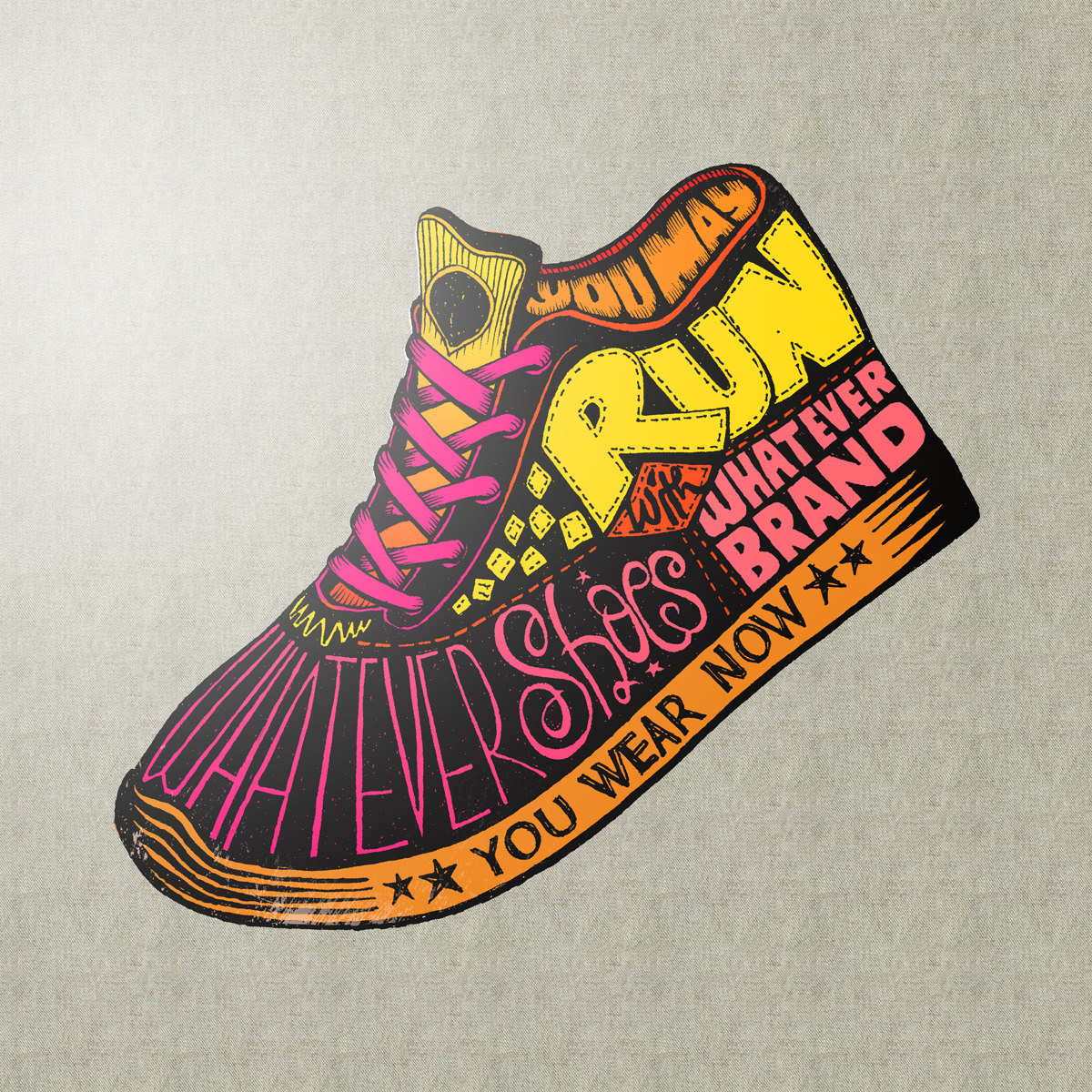
In 2014, I created an illustration to inspire people to run—regardless of how expensive or prestigious their gear is.


The message is simple: run with whatever shoes you have, no matter the brand. What matters most is the journey, not the gear.
You can buy this product on Society6.

Designed the logo for CV. Putera Ratna, an electronics company in Surabaya, inspired by circuit board patterns to represent connectivity and innovation. The client was my friend Adam Ainun Akbar, but I’m not sure if he ever used the logo.

My friends once discussed creating a fashion magazine website with me, but we failed to deliver. I take full responsibility for this failure—the issue was poor timing and overcomplicating the project. Back then, I hadn’t learned about minimum viable product (MVP) and insisted on a fully featured site instead of a leaner, workable version, which ultimately led to delays and missed opportunities.
I work as a freelancer. My role was to create design mockups for Taka Paints, exploring alternative design concepts to enhance the user experience and visual appeal of the platform.


Designing a logo is never just about aesthetics—it’s about telling a story, shaping an identity, and capturing the essence of a brand’s mission. When I set out to create the new logo for Good News From Indonesia, my goal was to craft a visual symbol that embodies strength, diversity, and optimism, just like Indonesia itself.
Every element in this logo is intentional, each carrying a deeper meaning rooted in heritage, culture, and national pride. The structure, motifs, and details are all carefully designed to reflect Indonesia’s vast richness—from its traditional arts and crafts to its unshakable spirit of progress.
Here’s the thought process behind every part of this logo:
The Letter G
As the first letter of “Good News From Indonesia,” the G naturally became the foundation of the logo. I designed it to be bold, simple, and strong, symbolizing the core values of confidence and trust. It serves as the backbone of the identity, much like a solid foundation for an enduring vision.
Logotype
The name "Good News From Indonesia" speaks for itself—it’s a brand built to spread positivity, pride, and optimism among Indonesians. The logo needed to reinforce that spirit, making the message clear and unmistakable.
The Elements That Shape the Letter G
Rather than a plain letterform, I constructed the G using diverse visual elements that represent Indonesia’s multicultural identity, historical grandeur, and abundant natural wealth. These motifs include traditional textiles, heirloom weapons, music and performing arts, intricate carvings, and architectural landmarks—all essential pieces of Indonesia’s story.
Traditional Cloth Motifs (Wastra Indonesia)
Textiles have always been a symbol of cultural identity. I incorporated batik parang from Java, paired with geometric patterns from various islands, to represent Indonesia’s rich textile heritage. These patterns reflect the diverse traditions, evolution, and unique character of each region.
Indonesian Musical Instruments
Music is an integral part of Indonesia’s artistic identity, so I included elements that symbolize this richness. The angklung from West Java, the bonang (gong), the flute, and the tifa drum from the eastern region were chosen to showcase Indonesia’s vast musical landscape.
Ocean, Fish, and the Pinisi Ship
Carving is one of Indonesia’s most remarkable artistic traditions. I drew inspiration from Majapahit-era carvings, known for their sophistication and influence on modern designs. To reflect regional diversity, I also included Balinese carvings and ornamental motifs from Aceh and North Sumatra, which are often used in architectural and decorative elements.
Rice and Cotton
Rice and cotton are widely used symbols in Indonesian government and institutional logos, including Garuda Pancasila, where they represent social justice and prosperity. I included them in this design as a reminder of collective well-being, fairness, and the pursuit of a better future—principles deeply embedded in the nation’s values.
Gunungan
Beyond music, Indonesia has a rich tradition of storytelling and theater, from wayang kulit (shadow puppetry) to ludruk and ketoprak performances. The gunungan, a symbol used in wayang, represents the journey of life, transformation, and cultural resilience—an element I felt was crucial to this design.
Garuda Eagle Head
Finally, the Garuda’s head plays a defining role in this logo. Its upward tilt signifies pride, confidence, and ambition, reinforcing the idea that Indonesia is a great nation with a bright future. The sharp gaze looking forward represents optimism and determination, tying together the entire meaning behind the logo.